Another Experience with Color Analysis
Happy Tuesday, ladies. Welcome to a guest appearance many of you know...Another Experience with Color Analysis.
Linda M is a regular participant and member of this amazing blog community.
So, many of you know that she was gifted color analysis recently and is wiling to share her experience with color analysis today.
I am so thankful to have her join us…and that is where we will begin.
ANOTHER EXPERIENCE WITH COLOR ANALYSIS: LINDA’S STORY

“Thank you, Pam, for so graciously inviting me into your “space” so I can share my color analysis experience with our community.
I’m excited to tell everyone that it was one of the most informative, positive, valuable and fun experiences I’ve ever had. Yep, it was that good!
I would highly recommend an in-person analysis. Anything that will help me get the best value out of my clothes budget, and make shopping the sea of clothes in the marketplace easier and time-saving gets my vote.
But first, if you have a significant woman in your life, try to get her to do it with you. My daughter-in-law, Megan, gave me a wonderful gift, and it was an experience I’ll never forget … we laughed ourselves silly (often cracking up the consultant too); lifted each other up when vulnerable; and offered lots of constructive feedback after it was over, and we were trying to apply the information to our closets.
I expected to get information, and instead I got an experience similar to what I get when I travel: an intro to a new culture and another perspective.

I did my analysis through House of Colour, and it was obvious the consultant had training (not to mention being a walking advertisement of how striking you look when you get your colors right … she was a brilliant, dramatic Winter).
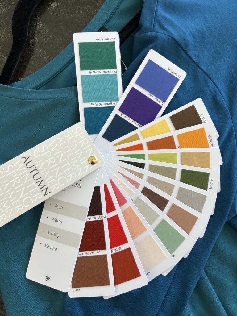
Because I color my hair, I was draped with my hair covered. Lots of cool vs warm color scarves are draped around your neck in succession, using natural light. I’ve been following Pam’s journey, looking things up and trying to figure out my best colors for a long time, so my result wasn’t a total surprise. Even saying that, some of my best colors were a surprise, and some I thought were fine were not (spoiler alert: burgundy and navy blue were not as good as I’d convinced myself they were). It’s super helpful to have all the colors in the same saturation and same fabric to do the draping. What was apparent to me almost immediately was how rich my color palette needed to be.

Pure white gave me blue shadows under my eyes and especially around my mouth, greyed out my skin, and turned my lips a funny color. It wasn’t just “off,” it truly robbed me of vibrancy. While it was quickly obvious that I needed warm, rich tones and likely was an Autumn, I was especially excited to get a more unique-to-me subseason. This was something I couldn’t ever have figured out on my own. I was typed as … Blue Leaf Autumn (I think Deep Autumn combined with True Autumn in other systems). While in the palette book there are many autumnal colors, the subseason gives you your “wow” colors, your very best. This was where the consultation had the best value to me. My list included kingfisher and peacock blues, dark olives, marine navy, and some golds. But the absolute best on me were the rich browns.
The system has a “three-point red” concept that was super helpful and I’d never heard of. You get three reds that suit you, and are encouraged to match a lipstick to each of them, after which they go with everything in your palette (wait … you only need three lipsticks in your life? Who knew?). One of my reds was a geranium that almost glowed in the dark. When the consultant pulled out that matching lipstick, I almost refused to try it on (thank you, Meg, for backing up the consultant and making me try it! You guys were so right). It was maybe the highlight of the consultation, to realize not only that I could wear that color, but that my face came alive in much more bright and richly-colored lipsticks than I’d been wearing. I’m sure some people know instinctively what colors to wear, and I would say that I was more self-trained to know some of what suited me. But there was no way I could have learned this much without the in person analysis and immediate feedback from a live person. And it’s a real confidence boost, as you can see in my pics. Let’s just end with the info that the “after” pictures were in failing daylight and I still look more glowing. Oh, and that I’m a person who hates, hates, hates to have her picture taken, yet I just had enough confidence to share it on a blog!”
ANOTHER EXPERIENCE WITH COLOR ANALYSIS: EYE OPENING

Linda and I, both, had an eye opening experience with color analysis…and I am so thankful to Linda for sharing with us.
Get more pictures taken, Linda…you look fabulous!
Her experience was really good for me today, because during fall and winter, I have been slipping back into my autumn garments…warm, but not so bright.
So, this is perfect timing to remind me of my own experience and how I felt when I saw the SPRING PALETTE on me.
Once my eyes are done with the cataract surgery, I will be so excited to see the colors clearly again.

I am more committed now to keep working on a SPRING PALETTE wardrobe…which means it may be time to move out more of the autumn for me….which has tempted me recently.
If you have questions for Linda or for me, please let us know.
Until tomorrow…..(when I have some fun in J.Jill new arrivals)…
EMBRACE TODAY & KEEP SMILING!!
By Pamela Lutrell
For all your shopping, please use the links on my SHOPPING PAGE…thank you, thank you to all who shop this way and show support for this blog. It means the world.
AND WEST TEXAS LADIES…FOR COLOR ANALYSIS CONTACT:

The talented Kimberly Clay, with House of Colour in Abilene
Thanks to Pam for inviting Linda to share her experience with the reader community, and to Linda for sharing your before and after photos. It’s so nice to be able to put a face with your name, as your comments always resonate with me, and often mirror my own thoughts. Both of your analyses made a dramatic difference, and both of your final looks are stunning.
I do have a question about this color typing system, which I first encountered through Pam’s posts. Do they address the contrast factor at all, or just recommend specific wardrobe colors? It has been 12 years since my own color analysis, and one of the most valuable things I learned was the importance of the contrast in our clothing mirroring the contrast between our hair, skin and eyes. It took me a long time to wrap my head around it, but once I understood it and started trying to incorporate it into my wardrobe choices, I started getting compliments at an unprecedented rate. I am considering getting both a new color analysis and a makeup tutorial or lessons. In fact, I may just drive to Abilene to see the same consultant Pam used, as her results are so striking.
Again, thanks to both of you for sharing what you’ve learned! I am endlessly fascinated by color analysis as it relates to our clothing, hair and makeup choices, and hope there will be more posts like this as more readers decide to take the plunge! I will look forward to tomorrow’s post on what JJill is dropping, as I’ve been hoping for more choices from my favorite retailer.
They did address that with me at my session…hopefully, Linda will share more on her session. I just went to Kim (the woman here) and got hair colors for the Spring Palette…I am considering a little change with my own hair once I discover more about my new eyesight.
TAM, my color analysis didn’t go into contrast specifically, but it was touched on. I’m told I look best in a monochromatic outfit that is rich and not light, and that as another best look, I could blend 3-5 colors. My palette contains few light colors (oyster is my best light neutral), and they are warm and not brilliant, so I think the palette would “naturally” create a rich, low/medium contrast look most of the time. She did mention that I can wear higher contrast. I’ve always known pastels wash me out. Going into summer, I will likely use more contrast … was thinking beige/oyster/khaki bottoms with geranium, coral, kingfisher, peacock and such on top. Otherwise, I’m not sure how this will work in the summer, so as not to look like I shopped for the wrong season. Thanks for your kind words. It can be hard to put yourself “out there,” so it’s much appreciated.
How cool was that?!!! Thank you Linda for the great story on your experience. You look fantastic, and I’m so happy you had a fun time with your daughter-in-law Megan. I hope if Texas Aggie does her analysis over that she’ll share here, too. Thanks for this post today, Pam, and the reminder of your draping picture. What fun!
Thanks to Linda for sharing her experience! (Your story is so well written too, which I always enjoy.) I am coming around to the idea, as, like Linda, I feel self taught on my personal colors. I could be so wrong!
I am so appreciative that you put yourself out there, Linda. We learn so much from one another. Thank you!
These sessions are so much fun…and eye opening…I am thankful Linda was willing to share her gift with us.
I know I was wrong…and shocked at the results…but once you see it, you can’t unsee it. Really helpful and to help us glow.
Thank you Linda M for sharing your experience with us. Many, many years ago when color analysis first started, or rather when the “ Color Me Beautiful” book first came out, I had my analysis done by a lady from church who had been to the training. I was “diagnosed” as a winter, and have used those darker, jewel colors ever since so for probably 40+ years I’ve worn black, white, royal blue, bluish reds, bright pinks, bluish greens. I too would be interested to have an analysis done by a certified House of Color analysis, but at my age of 79, I’m content with my current colors, and hope they are the colors that make me look better. I do get compliments and no longer even consider certain colors that I did wear prior to my color analysis. Enjoy your new knowledge, Linda M, as you curate your wardrobe and now your new needs.
Thanks for joining in with your experience, Celia.
Thanks, Pam and Linda, this is so interesting. Linda, you do look smashing! You are glowing in those colors.
So much fun for you LindaLM! We are subseason buddies! I didn’t have access to HOC; my gal is an independent analyst. I was typed by her as a deep, bold autumn but those are all my colors. I also was told no burgundy, no navy (marine navy is one of my wows), and no denim. I cheated and bought dark navy jeans last fall and she must be right. I wore them once and was very uncomfortable. Love the 3 red lipstick idea. My favorite is a tomato red, but it took me awhile to adjust. It is fun to go with someone else. We took notes for one another. Curious about the contrast discussion. It is a big part of my making it all work. I think you were going for style, too. Linda, you look beautiful!
Pamela, thank you for posting your draping again. It reminded me how spring lights you up.
I might be back later.
I have always been fascinated by color analysis. I have been told I am a summer but sometimes the colors seem so pale on me. I then turn to some winter colors. I really don’t live near anyone who does this.
Linda thank you for sharing. You do look great! And only 3 lipsticks look at the money that can be saved.
Glowing is always the best word I use for this experience. Thanks Marcia.
It reminded me as well, Deborah…and I needed to be reminded…I need to put that picture on my phone and on my desktop where I see it often. I also need to keep working on those colors and possibly move out some of the autumn ones.
It really can save money…I have wasted so much money on the wrong colors in makeup and clothing. The color analysis has helped so much with that. I just need to clean out the old more in my wardrobe.
I wish you would show a winter.
If someone is a winter and would like to share their experience, I am happy to share it. I am jealous of winters…I love those colors!
Loving these stories! I had my color analysis with a House of Colour rep, Sallie Morris, in Santa Rosa, CA. My whole life I had typed myself a summer (blue eyes, blonde hair, fair skin). We discovered that I am a Blue Spring! I love knowing, even at my age (turning 70 in two days), that I am wearing my best colors. Sallie is always available to help me choose lip colors too. But you, Pam, inspired me to take the step!
I can hear the joy in your comment, Lisa…so happy I played a role in this.
Found this so interesting. Was there more than just the two pics of Linda or am I missing something
I am 82 and was told years ago that I am a winter so mostly follow that line of colors. My hair has been white for years and I still want to look my best. May have my colors done again. Thanks for all the info.
Mary
I used the pictures that Linda sent. I know that if you are not comfortable with posting pictures online…like I have done for years..that it is difficult to put yourself out there. I am really thankful to Linda for sharing what she did…it does take some courage to do so.
Thanks to Linda for sharing her experience. If the lipstick you are wearing in the after picture is the one you didn’t want to try, I’m glad you did heed the advice to try it. You look fabulous in it!
Thanks for offering encouragement, Becky!
Linda LM, what a huge difference your rich colors make! And that lip color, wow! You can give away all of your white shirts! It is quite expensive and is only available up in Colorado Springs, 50 miles away. My husband would have to drive me and that would be hard to achieve. I’m 81 was a blonde, now mostly silver and white with blue eyes and fair skin. I have always thought that I was a summer but some of Pamela’s colors for spring look good on me in the summer when I have a little bit more color on my face. So it may be something I may consider this winter with my natural pale face. Is it possible to be both a cool colors in winter and light warmer colors in the summer?
I think in your case, Sydney. You just need to experiment in front of a mirror with really good light and see what colors brighten your face the most…then go with those. Colors that darken your complexion or make you look sickly would not be the ones to wear.
thanks Pam and Linda. The best colors are the secret. So glad you shared your stories.
Dear Linda M and Pam. Thank you so much for sharing your color analysis. It really is so helpful to know what your colors are. I liked the House of Colour Consultation so much that I gifted a consult to each of our three daughters. Interestingly, my daughters and I are all cool toned, but one is a winter and two are summers. Your comparison to traveling is so true. I gave myself this consultation at the end of the pandemic as I was retiring since a trip was not practical at that time. It was so like a good travel experience, an Odessey of the best kind! It was not cheap, but definitely worth the money.
Thank you LindaLM for sharing your analysis story. Its great to have a face to go along with the name. And your face is indeed glowing next to those autumn colors. Very interesting about the lipstick. I would love to have a House of Colour draping. The closest consultants are in Tennessee and South Carolina. Long drives but maybe doable in the summer when days are longer and the weather more predictable. I would like to know what my best colors are. I have some ideas but it would be so beneficial to have a professional’s recommendation.
Happy to do, Audrey!
How wonderful that you gifted your daughters with this experience! I hope to follow your lead some day! Thanks Mary.
I hope you get to do it someday, Kathie!
Thank you, LindaLM, for sharing your experience with us. The best part, to me, is that you and your daughter in law did this together! Now that is so special!!!!
I so much enjoyed reading Linda’s summary. You look so good, Linda! Your post is so well written, too. Hopefully, you’ll follow up with some shopping excursion or closet culling stories. It’s so special you did this with your DIL.
Thanks Kim…I really enjoy having some of the “regulars” here join in…so much fun.
I know, Carol…you are so right. I wish I could’ve done mine with my daughter, but want to be there if she every gets the experience.
What is the brand for your new geranium lipstick? I’m an autumn and would like to try it. Thanks!
I Chris…let me ask Linda and I will come back. House of Colour does sell their own makeup and that may be one of theirs …let me check it our for you.
Sorry, Chris, I just saw this. My lipstick is from House of Color. I will check the shade when I get home. I did order a Maybelline Superstay Matte in Dancer that I hope will be a dupe. It was delivered today, so I will swatch and let you know (the HOC is lovely quality, but not as long wear as I need some days, and the Maybelline is a one and done). Mac’s Chili is pretty close to the rust I got from HOC. Stay tuned 🙂 and I will comment again.
Chris … the geranium lipstick from HOC is LL 114 Melon Punch. The LL stands for Long Wear at HOC. The Maybelline Superstay Matte Ink 118 Dancer is so close there is virtually no difference. The HOC, though long wear, is more moisturizing and slightly less matte than the Superstay (which is more drying), but there is some transfer of color and wearing off in the HOC vs the Superstay. The color I was wearing in my picture was my rust. That is HOC LL 124 Tuscan Sun. Mac’s Chili is of similar intensity but slightly browner, though it is in the same color family. Hope that helps!