Living as a Spring Palette Woman
Happy Tuesday, friends. Welcome to the continuing saga of me...Living as a Spring Palette Woman.
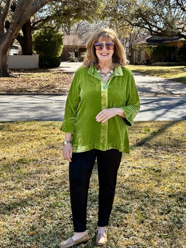
I confess that living as a spring palette woman has been a bit of a challenge for me.
While I have worn versions of the colors for a long time, I do not own many of the best colors.
Like the velvet top I am wearing today…it is an older John Mark top from Dillard’s that I wore on a cruise long before I learned that I am spring.
There are a few greens I can wear…but this shade is not one…though close enough I think it works.
Last year, after learning I was a spring, I ended up wearing mostly corals, the flamingo pink (Chico’s dried roses color), soft yellow, and off whites.
I think it is time to up my game this year…so after the closet re-do, this will be my plan.
LIVING AS A SPRING PALETTE WOMAN: ONE NEW WORD

Last week, I was studying my spring palette swatch book from House of Colour, and one word jumped out at me that I had not noticed before.
SPLASHY! Synonyms of “splashy” are noticeable, dramatic, commanding, visible, notable, even…flamboyant. I like that!
So, it occurred to me that I have been playing my spring palette a little too safe.
When I saw chocolate in my palette, I was relieved…I had plenty of brown and loved wearing brown. But, chocolate doesn’t make my face light up as other colors do.
I could see it when I sat in the chair at our local House of Colour…I could see that the brighter colors brightened my complexion just as the new hair color does.
The challenge has been to match the exact colors in my book and to focus on the words bright and warm….yes clear and light are important; but I believe I need more of the bright and warm.
(I hope this isn’t confusing)
SHOPPING GOAL NUMBER ONE: LOOK FOR BRIGHT, WARM, AND SPLASHY
LIVING AS A SPRING PALETTE WOMAN: IT’S IN THE STARS

Last year, I was excited to find ANY COLOR in my spring palette swatch book in a garment I liked.
But, in order to be my best warm and bright self, this year I have a different plan.
My color specialist, Kim, went through my book and put three stars on my very best colors; and two stars on the next level.
After evaluating my purchases last year, the majority were two stars.
Again, that is not a bad thing…I just want to strive for the stars this year! It also depends on the colors that hit the racks.
My three star colors (which I know you cannot see them)…are:
Chocolate Brown is a three star neutral
Bright navy
Coral Geranium Red
Flamingo Pink…this was an exact match to the Chico’s dried roses
Kerry Green
Mint Green
Canary Yellow
Bright Blue
Violet
Aqua
SHOPPING GOAL NUMBER TWO: MAKE THREE STAR COLORS THE PRIORITY SHOPPING…TRY NOT TO SETTLE
LIVING AS A SPRING PALETTE WOMAN: COURAGE TO CHANGE

Last year, my courage to change to a spring palette was slow going.
This time when I organize the closet, I want to move out more of the old colors in my wardrobe and commit fully to the new ones.
Why do this when I like many of the old colors?
Because, I do want to look vibrant, youthful, healthy, and splashy! Wearing the spring palette helps me to look that way.
Now that I have new eyes…the better to see colors with my dear…I can make more informed decisions. It is amazing how different the colors look after the surgery.
I am kind of shocked at how different the swatch book looks!

Except for just a very few pieces, the majority of my jewelry is already gold.
And I do prefer wearing gold.
So, accessories are good…though I might go back through the scarves.
Thank you so much for being here today as I think through Living as a Spring Palette Woman.
As I said, there is much to be done…but this kind of work is the fun kind.
Now, what are you shopping for this spring…any colors you would like to add?
I hope to see you tomorrow with another illustration of how I can step up my game….until then…
EMBRACE TODAY & KEEP SMILING!
By Pamela Lutrell
For all your shopping, please use the links on my SHOPPING PAGE…thank you, thank you to all who shop this way and show support for this blog. It means the world.
AND…visit my NEW CURATED SHOP where I will be adding my finds on a regular basis.
![]()
You always look sensational to my eye!
I’m just thinking out loud as I look at your palette of colors / have you worn true orange? I see it there and I’m trying to envision you in a true orange tunic with white jeans? Or white pants of cooler fabric?
Ah! There you are! Love the look and the new word “splashy” is perfect. The glasses are great for making a statement and your glasses-less face is radiant with your hair color. I think when springs are “diagnosed”, it is difficult for them to go bright right away. It took a friend of mine about a year to accept and find her balance. You are way ahead. Now you can see clearly and forge ahead. I think that green top would look good with off white neutral jeans. Wouldn’t it blend with your other greens? I was told we have hundreds of colors; they can blend, not necessarily match. You are looking fab!
Hi Paulette! In my best colors given to me from House of Colour….there is no true orange. There is a tangerine (light orange), a peach, and a light peach. Tangerine has two stars…I might look for something to try on. I love orange, but said goodbye to it when I went from an autumn to a spring. Thanks for being here. I do have lighter colors of pants and will be wearing them very soon.
Pam, you look vibrant and splashy in these pictures. The new hair is light and fresh. I really think the green color looks fantastic on you. What fun you are having!
It is fun, Marcia. Green is one of my favorites…I want to work harder to find the right greens in my palette and see what happens!
Thanks Deborah…I do love this green top and may keep it to blend with other greens…that would be fun to play with. Thanks for the story aboutyour friend…makes me feel like I am not the only one!
“ Splashy” seems to go along with our discussions of feelings we become invisible as we grow older. To be noticeable, visible, even flamboyant are all traits we have decided are good if we want to not be invisible so your colors are literally telling you how to achieve that. Such a pretty top and I love all your bangles!
Yesssssss, Pam! That first pic says it all, and it’s not even your really best color. Splashy is the perfect word. My daughter in law, a golden true spring, is feeling the same struggle. She is trying to put together the brights in a way that makes sense, and to me, the spring palette, gorgeous as it is, isn’t as “easy” to find and blend as my blue leaf autumn is. Because she’s not as dramatic style-wise as you, our consultant urged her to use a very bright “splash” (consultant’s word too) of color on a neutral base. For our grandson’s baptism last weekend, she wore a cream lady jacket with a bright coral shell and blue and green beaded necklace (made by me :)), with green suede heels. She looked smashing. I think for all of us, the neutrals or the base is the most challenging, because it’s how we get dressed, but at the same time, the biggest bang for our buck, color wise, is in our tops or neck area. I’m in the midst of finishing my weight loss, and have bought nothing, which has given me time to ponder, budget, start working through the closet, and make lists of what my basics should be. The dangerous part of doing so is you think, well, this navy is kind of warm, so it’s ok (the navy I own isn’t warm, true navy isn’t even in my palette, but I slide into it easily). I found a site on Amazon that sells 100 percent silk scarves in many solid colors for about $20, so I’m thinking I might add a few and use those to bring my colors to my face as I build my wardrobe. My consultant said, “wait, do not settle,” and she’s right. But if I were not on the cusp of a smaller size, I might not be able to make myself wait. Lol! I’m going to be following your journey closely. (And please look for that geranium color that’s in both our palettes; I think it would be amazing on you).
Thanks Celia…Feeling invisible is not a problem for me…so I will lean into my colors and have some fun.
Now that Valentine’s is over and the President’s sales are done, I hope to see more new arrivals beginning this week..so I will be on the hunt for our geranium…it is such a vibrant color…I hope to find it. Three stars on my list1. I need to listen to your consultant…wait, do not settle.
I may write that on a sticky note and put it here on my desktop! Thanks for sharing, Linda.
You still do look nice in that first photo with the green top even though it’s not in your palette.
With your new hair color now you can focus on what looks best on you.
I do like that word splashy for you. It seems to fit who you are( even though I have never met you in person.)
Thanks Paula…I feel like I have met everyone who stops by regularly! The top will stay in the mix…since it is velvet, I can only wear it for a little while.
Well hello Splashy, that is such a great word, and I think it describes you perfectly I think standing out and being noticed is a huge compliment. You “go girl.” I sense that you are getting it all or most of it back together. I love the green on you.
I think going through a transformation like this is so good for mind, soul, and spirit.
Here is to a joyful and meaningful day.
Wear what you love! If you look good in something, even if not on the Spring color wheel, and you feel vibrant, go for it! You will exude joy no matter what. Sticking to a strict formula in my mind makes fashion more “work”. And expensive to change everything up. A few tweaks is all you need. A new cut and color plus new glasses is very uplifting in itself. For example, I believe I am a winter, but in the summer a bright orange is very flattering somehow. As is a rose color with navy in the spring.Who would guess?
You look fabulous. Love the hair color. Are your bangs cut different? They look lighter? Shorter? I’m thinking that maybe I may also be a spring, after years of being an autumn….hummm?
You look beautiful!!!
Happy Tuesday, and Happy Fat Tuesday (Mardis Gras)! We will be celebrating with all our neighbors tonight in the annual dinner of Jambalaya. Your bright green top has inspired me to search for something Splashy to wear paired with lots of beads!
I agree, Katherine. Mixing things up a bit is always fun….Splashy…I like it!
I love that these colors brighten my complexion and put a glow on that no makeup can do. You can see the darker colors pull down my face. So it really does make a difference and is worth the work…which isn’t work to me…just more fun. I always look at what a color is doing to my face. The one I am wearing today works well for my complexion though not a perfect green in my book, but the blacks I loved so much at one time, just make me look older. For me I want to look vibrant, healthy and joyful.
I get my bangs trimmed once a month and these were just trimmed. I thought I was an autumn too, but when I saw with my own eyes what the spring colors did for me, I knew I was a spring. Thanks Carol.
Yes…wear something splashy…perfect for Fat Tuesday and now you have me hungry for jambalaya. Have a fun time tonight, Connie.
Well, it did it again! Wiped out my note. It jumps and goes up to the top of your blog and my note disappeared. Some days I’m just not up to writing it again. My best colors are cool pale blues, greys and pink with a chalky white when I can find them. Cool navy is my neutral base. I love that rose color on you the best! You just glow in it!
I wish I knew why it happens with you, Sydney. Thanks for your perseverance.
Pam, you look terrific! Your sunglasses are so cute too.
Like you, I thought I was an autumn. I think it’s because I love fall colors so much—teal, rust, olive— I love them and wanted to wear them. After your color testing and your “spring” discovery, I reevaluated and realized I think I’m a spring as well. I did the color test on the Kettlewell website and when I saw the palette of colors, it confirmed it for me. The colors for a spring are the colors I’ve always been complimented in, but I never really took it to heart. I’ve been more content in neutrals. That changes now 😄 Your color journey has been such an inspiration. Splashy! I like it.
Here’s to the splashy girls! Let’s have some fun, Cindy.
Pamela, love the hair, love the jacket, love the glasses. I’m surprised to find I like the darker hair much better than I thought I would.
Just made your Mexican stew oh my goodness Pamela I’ll never make chili again. That is outstanding for a dump recipe. Company worthy for sure.
I love the green velvet top. Don’t forget that velvet reflects a lot of light, in this case all the gold shimmers–splashy indeed. I think you can and are rocking that shade of green in the velvet fabric.
So glad you liked it Suzi! The hair is darker because of the emphasis on gold. I was amazed at the difference it made. But does make sense for a spring.
Thank you, Mary. Looks like the right bright colors will have me feeling splashy!